HELLO

Malwarebytes Anti-Malware Restoring Trust: Malwarebytes Ecosystem Redesign. In 2013, Malwarebytes had 500 million downloads but faced a critical retention problem: the interface itself looked like malware. Users were uninstalling the product because the 'black and red' utility aesthetic triggered anxiety rather than safety.
The Problem: "Is this real or fake?"
“The first time I saw the new interface, I had to double-check to make sure that it wasn't some fake antivirus/anti-malware app."
— Reddit User Sentiment
“I immediately uninstalled it. I didn't know if it was real... or malicious."
— Reddit User Sentiment
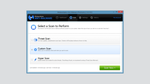
Product Strategy: Simplicity & Consistency
My objective was to pivot the product language from "hacker utility" to "consumer essential." I led the UX/UI overhaul for Desktop and Android, replacing anxiety-inducing warning patterns with a clean, status-based architecture. The redesign introduced the "Green Smile" indicator, giving non-technical users immediate, emotional confirmation of their safety.
Unified UI Framework: We standardized the dashboard architecture across Desktop and Mobile, focusing on a clear status indicator ("Your device is safe" Green Smile).
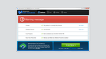
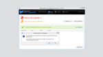
Before: Legacy Interface (2013)
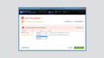
After: Redesigned Interface (2014)

Transformation: Moving from alarmist 'warning' patterns to a status-based dashboard that confirms safety at a glance.

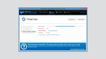


Feature Highlight: The "You Are Safe" State
Security apps often rely on fear. We flipped this model by introducing the 'Green Smile' status indicator on mobile. This gave non-technical users immediate, emotional confirmation that their device was safe, reducing the cognitive load of interpreting complex logs.
New Malwarebytes Anti-Malware Mobile App


"I really like the new Malwarebytes 2.1, simple UI, not all those garish colors. The old MBAM 2.0 interface was frequently compared to fake AV by the technical crowd; MBAM 2.1 offers a simpler interface that also works for the novice user.
The banner ads are gone from the Dashboard, as are the garish colors and alarming colors for minor programs. Cleaner, minimalist banners appear at the bottom of the scan progress window, but are not distracting and don't feel like they're trying to upsell you."
— Reddit User Sentiment
All Products